Most beginner websites look… well… like beginner websites. But with a few simple design tricks, you can make your site look clean, modern, and professional.
Here are 5 powerful design tricks inside Website.com that instantly upgrade your website design.
Trick 1: Use a Clean Color Palette
A common mistake beginners make is using too many colors.
Instead:
- Pick 2–3 main colors
- One primary brand color
- One accent color
- One neutral color
Inside Website.com, you can apply a global color scheme so your entire website stays consistent.
These are designer made colour combinations, so just choose Design, and then colours, and pick your palette.
The result is that your site instantly looks more professional and branded.
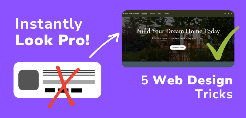
Trick 2: Use Large Hero Sections
Professional websites almost always start with a hero section, also called a welcome section.
A hero section includes:
- Large background image
- Clear headline and supporting text that lets visitors know what you offer and how you stand out
- Call-to-action button
So here’s an example layout:
- Headline: “Build Your Dream Home Today
- Subtitle: Affordable home renovations that fit your budget.
- Button: “Design My Home”
This makes visitors immediately understand what your site is about.
Trick 3: Use Lots of White Space
Beginners often cram everything together.
Professional websites use white space to create breathing room.
Inside Website.com, sections are predesigned to incorporate breathing space to avoid this mistake. Make sure you don’t cram too much text in the text areas. If you need more space, you can:
- Increase section padding
- Add spacing between sections with a spacer section.
The benefits are that your website will be easier read, you’ll have a cleaner layout, and overall, you’ll achieve a more premium feel. Note that “white space” doesn’t necessarily need to be white in colour – it just refers to a lack of elements and empty space that provides breathing room for the web design.
Trick 4: Use High-Quality Images
Low-quality images make a site look cheap.
Instead:
- Use high-resolution images
- Keep images consistent style
- Avoid pixelated photos
In the meantime, the Website.com site builder includes professional stock images you can replace easily. Just click on an image and change the media. In the File Manager, you can upload your own images, or choose Explore > Stock Images to use the copyright free stock images included for free with your plan!
Trick 5: Use Clear Call-To-Action Buttons
Every professional website guides visitors to take action.
Examples:
- “Contact Us”
- “Get a Quote”
- “Start Your Free Trial”
Make sure your buttons:
- Use contrast colors
- Are large enough
- Appear multiple times on the page
This improves conversions and usability.
And that’s it! These 5 simple Website.com design tricks can make your website look 10x more professional without hiring a designer.
Here’s a video to demonstrate how to implement these changes to your web design within the Website.com site builder.