As a freelancer, every marketing tool makes a difference when it comes to getting hired. You can make your own freelancer website using the Website.com site builder to quickly find clients. Follow along with the video, or read the transcript below:
Transcript below:
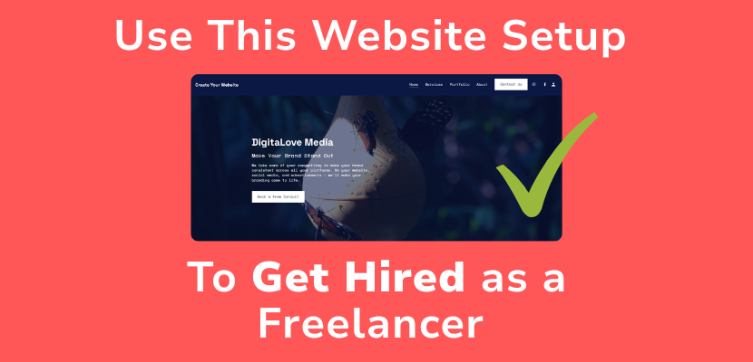
In this video, I’ll show you the exact website setup that actually gets you hired, even if you’re just starting out.
If you’re a freelancer: designer, writer, developer, marketer, your website isn’t just a portfolio…
It’s your #1 sales tool.
And today, I’ll walk you through the perfect structure, what to include, and how to set it up step-by-step, using the Website.com site builder.
The Goal of Your Website
First, let’s get one thing straight:
Your website is NOT just about looking pretty.
Its job is simple: Turn visitors into clients.
That means:
- Clear messaging
- Strong proof
- Easy contact
Everything else is secondary.
The Perfect Freelancer Website Structure
Here’s the exact structure you should follow:
1. Your Homepage is your pitch
- Who you help
- What you do
- Why you’re different
Example:
“I help startups design high-converting landing pages.”
Add a strong CTA: “Book a Call”
2. Portfolio (Proof)
Don’t just show pretty work. Show results.
- Before/after
- Metrics (conversion rate, traffic, etc.)
- Short case studies
3. In your Services Page, Clarity = Money.
Confused visitors don’t buy.
List:
- What you offer
- Who it’s for
- And optional is your starting price
4. Now the About Page is your Trust Builder
People hire people.
Include:
- Your story
- Who you’ve worked with
- Why you do this
Your about page can compel users to want to work with you.
5. Your Contact Page is your Conversion Point
Make it so simple.
- Use a short form
- Or direct booking link
And I have videos showing you how to set either of those up, take a look in the description for more in-depth tutorials.
For now, I’m happy with this contact page that has this contact form.
Design Tips That Actually Convert
Now let’s talk design, because bad design kills trust instantly.
Keep it:
- Clean with lots of white space so your content doesn’t feel cluttered.
- Mobile-friendly
Luckily, the Website.com site builder starts with a designer template, and sections are pre-designed to incorporate whitespace and are laid out so you can create a professional design.
Just enter your images and content, and customize the sections to match your branding.
The website design is automatically mobile optimized, so you don’t need to do anything, and if you go to the preview, you can take a look at it.
Common Mistakes
Quickly, avoid these website mistakes:
Having no clear niche
Too much text
No call-to-action
Weak or no portfolio
Fix these, and you’re already ahead of 90% of freelancers.
If you set up your website like this, you’re not just ‘online’… you’re actually converting visitors into paying clients.
If you want an easy way to build this exact setup, go ahead and sign up for a Website.com website builder account.
If this helped, hit like and subscribe to @websitedotcom for more videos on growing your freelance business. Thanks for watching!