The Website.com Builder allows you to easily create a mobile version of your website. By switching to the mobile editor, all of the web elements on your desktop version will appear on your mobile version. You will simply need to move or adjust the size of your elements to fit within the mobile view.
However, there may be times where you would like to only display a certain element on your desktop version, or vice versa. Alternatively, you may also want to have different styles for certain elements (e.g. blue button on desktop, orange button on mobile).
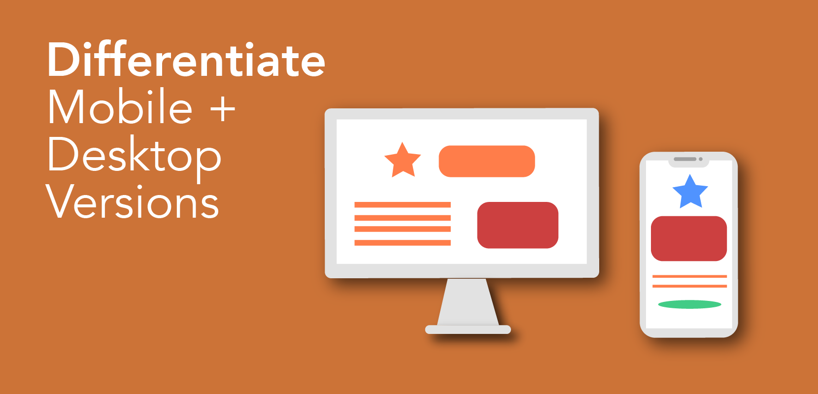
If you are looking to create more variation between your mobile and desktop sites, have no fear! These “hacks” will allow you to display different web items or styles on the desktop and mobile versions of your site.
Making an element visible only on desktop:
1)Log into your website builder, and create the desktop version of your site.
2)Switch to the mobile editor. Find the element that you don’t want on the mobile site, and click and drag it to be outside of the mobile device frame. The element will not be seen on your live mobile site after publishing.
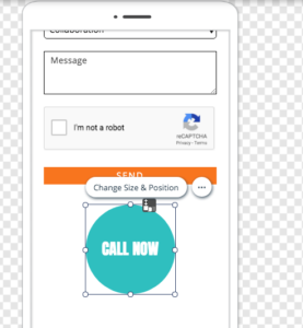
Making an element visible only on mobile:
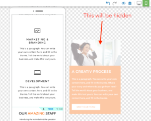
1)First, add and hide an element on the desktop side. To do this:
a. Log into your website builder, and create the desktop version of your site.
b. If there is an element that you would like to appear on the mobile version of your site, you will need to add it to the desktop version.
c. “Hide” the undesired element behind another element: move the element to the desired position, and right click on the element > Arrange > Send to Back OR use the Change Layer function to place it below the other element.
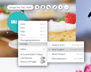
Tips: Ensure that the element you are hiding the unwanted element under has full opacity (not transparent). You can also adjust the size of the element to fit under another element.
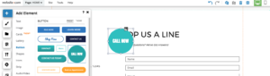
2)Next, you will need to make that hidden element visible on the mobile site! To do this:
a. Switch to the mobile editor. Find the element that you had previously hidden on the desktop version. Change its layer order so it will no longer be behind another element. Click and drag on the element to the desired position on your mobile site.
To have different element styles on desktop and mobile versions:
1)On the desktop editor, add 2 of the same element. Decide for yourself which element will be for the desktop version, and which one will be for the mobile version. Set the styles for each.
2)On the desktop side, “hide” the element meant for the mobile side behind another element. You can hide the element by clicking and dragging the element on top of another element, then using the Change Layer function to place it below the other element. See the instructions above for making an element visible only on mobile.
3)On the mobile side, find the element that you had hidden on the desktop side, and adjust its layer order and position. To hide the “desktop” version of the element, simply drag the unwanted element outside of the mobile device border. Elements outside of the border will not be seen on the published mobile site. See the instructions above for making an element visible only on desktop.