It can sometimes be hard to notice things until they aren’t done well. This is the case with typography, which is the field that websites fonts can be categorized and sorted under. Typography is typically only noticed by the average website visitor when it’s done poorly. This is why it’s important to do a good job when choosing your site’s typography.
Typography is the art and technique behind arranging, styling, and using text on websites. Even though it likely goes unnoticed by the majority of website visitors, it’s crucial in determining the reading experience of your content. This is important because your content’s reading experience contributes to whether site visitors decide to stay or leave your website. The better the typography, such as a website using an appealing font or being consistently well-designed, the less we notice how well-done it is. Only when something’s typography is subpar, such as when a site has clear design inconsistencies or uses unappealing fonts, do we realize how important typography and the use of fonts are in designing websites.
Understanding typography and fonts are important, but learning about these topics might come with vocabulary that can make learning about them seem harder than it really is. This article will go over basic vocabulary that you’ll find when working with typography and online fonts. After reading this article, typography, the terms used, and why fonts matter for online content should be less confusing and make more sense to you, regardless of your prior experience with this subject.
Typography Basics
Typography is the art and technique behind the arrangement, stylization and use of text. This is a term often used online and is important in determining your content’s reading experience. Typography is a more general term, and under it are some more terms that need to be understood before we decide what your site will look like.
The term font family is applied to a wider division of individual fonts grouped because of their common and/or similar aesthetic qualities. You can use font family and typeface interchangeably, because these two phrases both mean the same thing.
The term font refers to a particular font that can have its size, weight, style, and more customized in unique usage instances. What is the difference between a font and a typeface? Think of the typefaces as a musical genre, where there are differences between genre songs, but at the end of the day, separate songs are in the same genre because they have the same qualities and elements. Now think of fonts as individual songs, where each song is different, but the individual songs/fonts have similar features meaning they can be grouped together into the same genre/typeface. Although typefaces and fonts are incorrectly used interchangeably by some sources or people, keep in mind that these two terms actually refer to two different concepts in typography.
How Important Are Fonts?
Font size determines how large text will look to readers, and is usually customizable when creating websites. Font weight is what measures and decides whether a font is bolder or lighter for readers.
Text stylizations are settings that cause the common visual changes you see in text, such as italics, how spaced apart the text is, and what color the text is. Text stylizations give you control over the features of individual fonts, so any font can be changed to better suit your use for it.
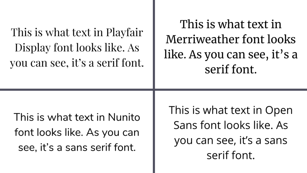
When looking through different fonts online, you’ll come across the terms serif font and sans serif font. A serif is an ornamental embellishment on letters as an aesthetic accessory added on some fonts. Fonts designed with serifs are called serif fonts, and examples of common serif fonts are Playfair Display, Merriweather, and Noto Serif. Fonts designed without embellishments are called sans serif fonts, and common examples of sans serif fonts are Nunito, Open Sans, and Montserrat.
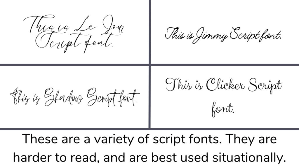
Another font type is a script font, which is designed with the fancy, smooth and uninterrupted look of handwritten words. It is less common than serif and sans serif fonts because it is harder to read. Also, unlike serif or sans serif fonts which have flexibility in their usage, script fonts are only suitable for use in specific situations, such as special page titles. This is why script fonts are used much more rarely compared to serif and sans serif fonts. Compared to script fonts, serif and sans serif fonts are the only two types you need to pay attention to when choosing fonts for your site.
Tracking is a term used to describe the distance between all the individual letters and words when using a font. Tracking is interchangeable with the term line spacing, a term used when working with HTML. It’s important to present appealing tracking in your content, both in making sure things aren’t too spaced out or cramped, because strange word spacing will immediately stand out to readers in a negative way.
Leading is a term used to describe the vertical distance between separate lines of text. It can be used interchangeably with the term line height, which is used when working with HTML. When you refer to concepts like single-spacing or double-spacing text, leading is what you’re actually referring to.
Content Hierarchy
Content hierarchy is the concept of designing website elements, such as headings and text, based on which of these elements is most to least significant. Different font sizes, thicknesses, typefaces, and more can be used to build a hierarchy of content that readers and search engines alike can pick up on. It’s a feature present across many website creation tools because of its importance to online content. You can set hierarchies with differently-ranked titles and headings across one site page. For example, you can set the most prominent title of your page to be Heading 1 or H1, and following headings would be designated H2 or H3 depending on their importance in the page.
In particular, Heading 1, also known as H1 or h1, is the key to a page’s SEO (search engine optimization), because it plays the role of indicator for a page’s title and tells search engine crawlers what this page’s purpose is. Using H1 on a page is important for search engine crawlers to find out what your content is about, and it’s often the first and most prominent thing visitors see on your page since, most of the time, H1 will be the biggest text on a screen. Effective use of H1 text is essential. Each site page must have only 1 H1-tagged title or heading, include at least one of the target keywords in the H1 tagged content, and may not use each of the target keywords more than once in the content of this label. The importance of H1 text for search engine crawlers is why you should keep these hierarchy rules in mind when designing your site’s page layout.
In the website.com Site Builder, viewing and changing a piece of text’s content hierarchy can be done by clicking on the text box, then clicking on the “More…” button that appears above the text box. Clicking this button opens up a menu with a larger colored button that says “Edit Text”. Click this button and a new menu should appear above the text box that features various options and icons. In the top left corner of this new menu is a line of text that opens a drop-down menu when clicked. In this menu is where you will see options like “Site Title”, “Page Title”, and “Title 1”. Of these options, “Site Title” is the h1 of this menu, so select this option to establish the title of your site as being the Heading 1 content for your site page.
Bottomline
After reading this article, we hope you’ve become more informed and knowledgeable about how to use fonts, how to think of typography, and how to keep appeal to readers in mind.