
Any site owner wants their website to be as pleasing of an experience as it can be for visitors. Site visitors’ first impressions of sites are solidified within 0.2 to 2.6 seconds of first arriving on a site, and these first impressions are 94% based on a website’s design. The importance and short time that a site design has to impact site visitors enough to stay make it vital to your site’s design that you should never overlook.
Color schemes are key for website design and for site visitors’ experience. It’s important to note that designing a website’s color schemes is not an extremely difficult task to accomplish, but it is also a process that takes some thought and effort in order for it to be done well. The tips and advice we share in this article should give you a clear idea of how to use color schemes on your site.
Use White Space
The term “white space” can be used to describe any open space on a website page without any content in it, even if it’s not the color white. This space is meant to spread out content and contribute to a site’s overall design. Every website needs some white space to properly space out its content, as demonstrated by the image below. Even a bit more white space can make a big difference in how your site presents itself to visitors. Readability and openness are quickly improved with just a small amount of attention towards using white space.
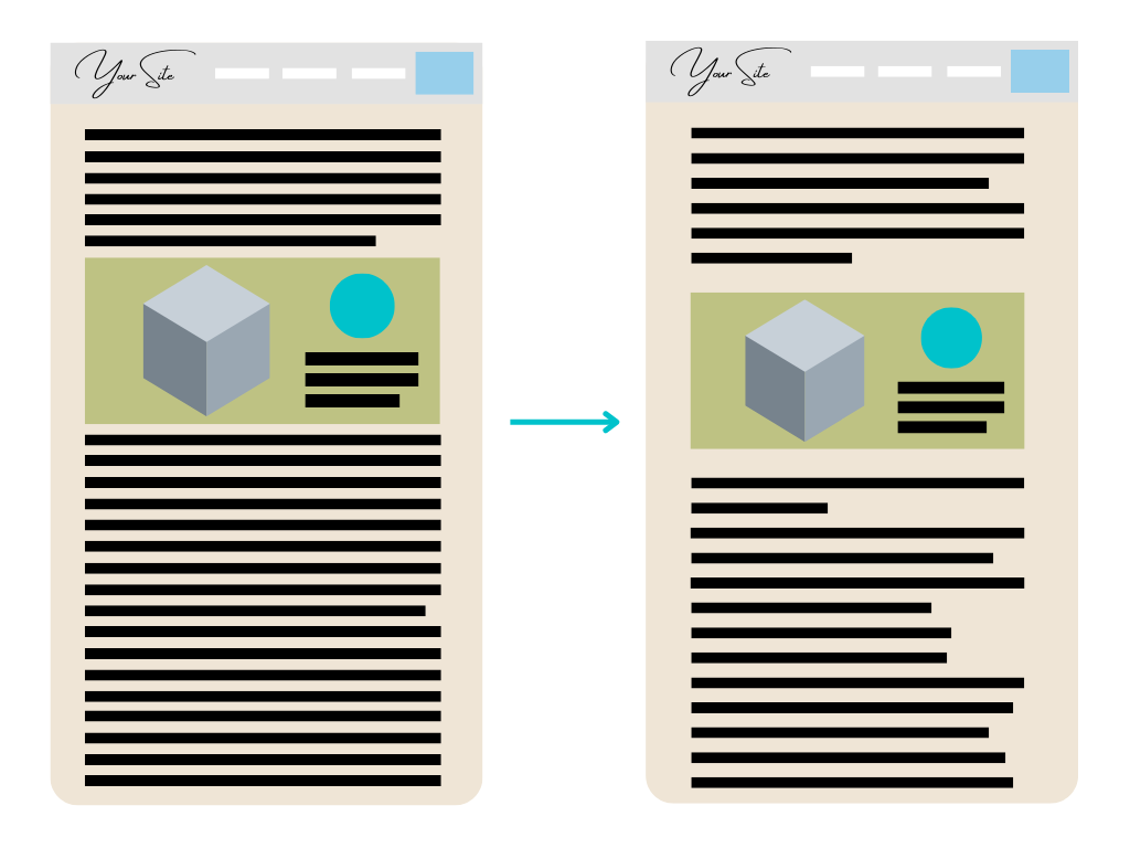
By subtly increasing the page’s side margin widths, increasing the distance between the images and text, and adding more organic spacing within the text lines and paragraphs, the white space of the page is easily increased.
Line Spacing
Line spacing is the distance between two separate lines of text within a single text box. With the Website.com Site Builder, you have the freedom to customize the line spacing of text boxes you use on your site pages. Typically, many web designers prefer to use line spacing at 1.4 because of it’s balanced and pleasing look. You can also consider using line spacing in the ranges of 1.2 to 1.6, but be sure to eyeball the look of the text yourself to make sure everything still looks presentable.
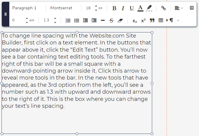
How to Change Line Spacing
To change line spacing with the Website.com Site Builder, first click on a text element. In the buttons that appear above it, click the “Edit Text” button. You’ll now see a bar containing text editing tools. To the farthest right of this bar will be a small square with a downward-pointing arrow inside it. Click this arrow to reveal more tools in the bar. In the new tools that have appeared, as the 3rd option from the left, you’ll see a number such as 1.3 with upward and downward arrows to the right of it. This is the box where you can change your text’s line spacing.
Color Balance
When using different colors on a site’s design, you aim to create a visually interesting and pleasant design for your visitors. This is why it’s vital to remember the key rule of color usage: the goal of colors isn’t to overwhelm white space, but to complement and enhance it. Replacing the majority of white space and basic colors on your site like white, black, gray, cream, or any other colors there are is not your goal. You want to add colors to your site’s base design tastefully, so that the site’s presentation is a good balance of some but not too many colors.
Consistent Color Use
Integral to a site’s visual appeal is the consistent usage of colors for different layout elements within the site. Different colors will apply to different widgets, buttons, bodies of text, and more across your website. You should use the same colors consistently for the same elements across your entire website. This consistency in color usage will help your site visitors navigate your site better, as they’ll understand more clearly what different colors and elements mean on your site. If different colors are used across the same elements with no consistency, site visitors will become confused by how to navigate your site, giving them a negative experience while using your site. Additionally, inconsistency in your usage of color and design for your site elements will give site visitors the impression that your site lacks professionalism. This is why using consistent colors across different pages of your site is key to designing a presentable site.
In this next section, we’ll discuss what you can consider when choosing colors to use on your site, and how they can appeal to your site visitors.
Use Colors to Represent Your Site
When selecting colors to use on your site, there are several things you could think about to decide what colors to use for your site design. One is to choose colors to use based on how you plan to use your site. For example, a florist would choose very different colors to represent their site compared to a consulting business site. Based on what you plan to use your website for, you can choose colors that are representative of you and what your site does. A cohesive color or set of colors used on your site can make strong positive impressions on your website. This can help your site stand out to visitors, letting you connect to them and encourage them to support your business.
Color Inspiration Around You
Inspiration for choosing your site colors can be found nearly anywhere you look. Something as simple as a Google search, or your favorite photo of nature, can lead you to finding suitable and appealing colors for you to use on your site. If you use Google search to find color schemes for example, you will be able to access countless color palettes, color tone guides, mosaics, and more that people upload online for anyone to use as inspiration for choosing colors. If you look for colors based on photos that you personally appreciate, you could choose colors that you like from those photos, then look online for other colors that would compliment your chosen color. This would let you create a color scheme for your website that is very standout and unique to just you.
Premade Color Schemes
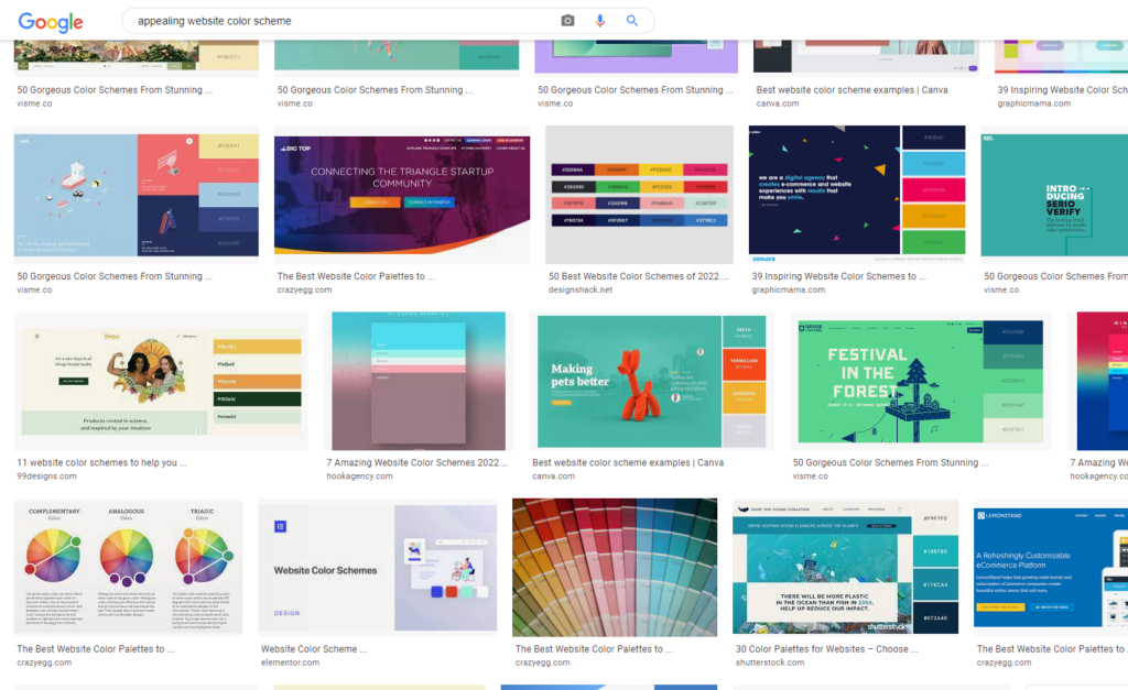
Premade color schemes are sets of colors that have already been chosen for you to use together in a single location. These colors are typically harmonized with one another, meaning they are pleasing to the eye when used together. You can find them easily by entering phrases like “appealing website color schemes” on Google, which will give you a wide range of results showing different color schemes used in different ways. Premade color schemes are also found on online site design and building services. From here, you can have the choice of using some, one, or all of a premade color scheme’s colors for your own needs. Premade color schemes are often designed and chosen by people passionate and experienced with design, who also have industry experience. This means these color schemes usually have knowledge and experience supporting them, so they can always be a good choice for your site.
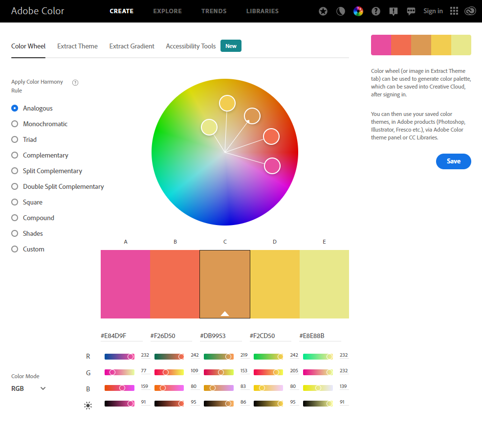
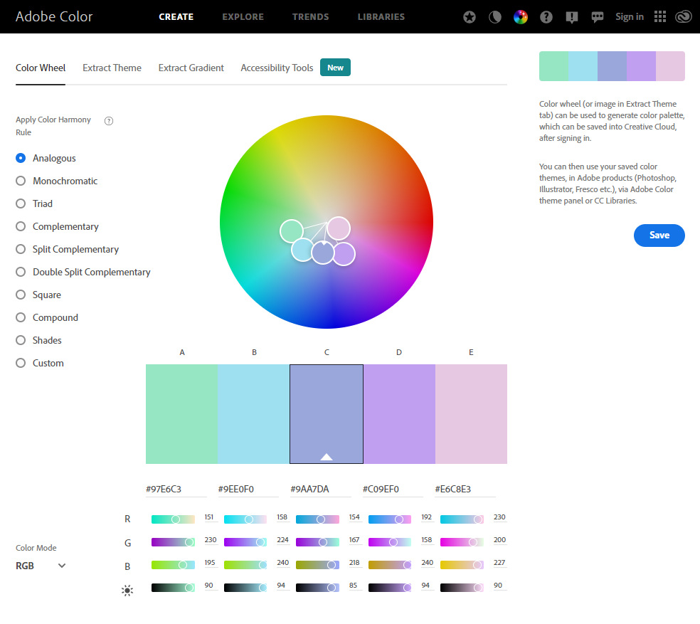
Adobe Color Wheel
The Adobe Color Wheel site is a free site that provides users with customizable harmonized color palettes immediately ready for you to use. Color theory is used by Adobe to give users a harmonic balance of colors customized by their users’ freedom and choices. To use the site, simply move the color selection circles around a color wheel with your mouse to receive unique color palettes. By dragging your mouse around the color wheel, entirely new and unique color schemes can be created. A variety of Color Harmony Rules can be applied to set contrasts and differences between colors based on what you’re looking for. Infinite possibilities and potential await with this site.
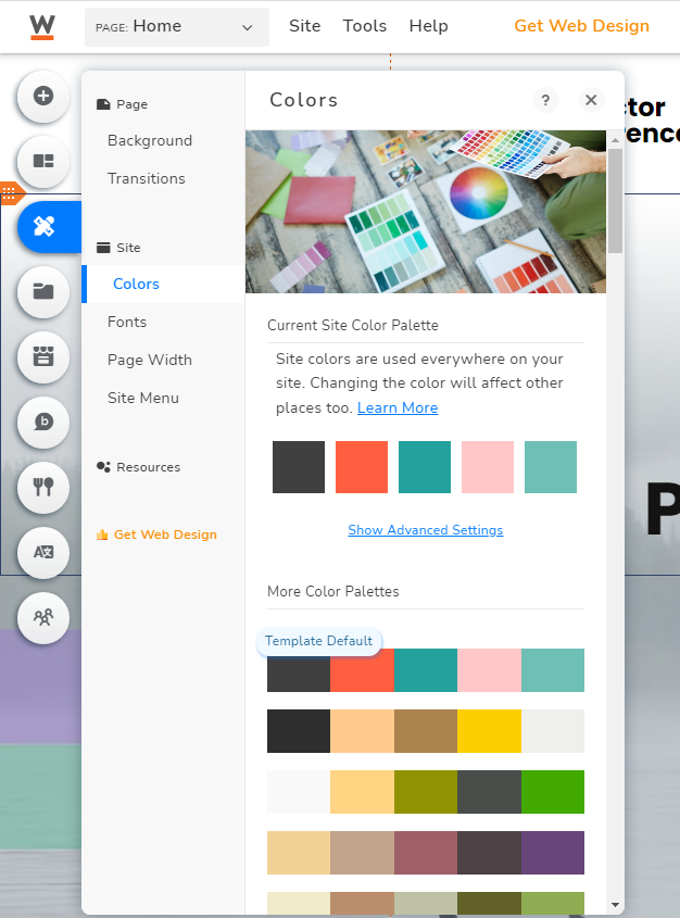
Website.com Premade Color Schemes
Within Website.com’s Site Builder, premade color schemes are readily available for you to apply to your site, and they’re just a few clicks away. In the Website.com Site Builder, look to the left of your screen to see a column of circle buttons. Find the button third-down from the top labeled “Design” and click into it. Clicking this button will open a window within the Site Builder, and to the left of this window will be a column of options you can click into. Find the option called “Colors” under the “Site” section to open a menu where you can select from a vast variety of premade color schemes that you can apply to your site in an instant. This ease of selection makes for a convenient and efficient way to apply a color scheme to your entire site.
Smart usage of color schemes is the key to making your site unique and stand out to your visitors. Be aware of white space usage, choose colors that improve and don’t overwhelm your site design, and take inspiration that you like from anywhere you can find it. Consult online resources for countless appealing options, or when unsure about what or how to use color schemes. We hope this guide on finding and using color schemes helps you when designing your site.