
Website design is the key to making an appealing, put-together site browsing experience for your website visitors. From making strong first impressions to creating a visually intuitive interface for your site visitors, proper or improper color design on your website can make a huge difference in how your site performs. Read this article to learn how you can improve your website’s color visuals to make simple but impactful differences in how your content is presented and interpreted by your website visitors.
The Importance of Color Schemes
Making first impressions can be all-important for any website. Color schemes are a big part of deciding whether you make strong first impressions and consistently attract visitors to your site. If your site visitors like the first impressions your website gives them, they’ll be more likely to want to stay and continue browsing your website’s content. On the other hand, if your site visitors don’t like the first impressions your website gives them, they’ll be more likely to want to leave your website and look for content to browse elsewhere.
The visual appeal of color schemes on websites extends beyond just first impressions. Across your website, your visitors will be able to see how consistent your color scheme usage is. Having consistent color schemes across your website content comes across as having a neat and well-planned collection of content, while having inconsistent or strange color schemes comes across as having a scattered and unorganized range of content making up your website.
With how important color schemes and the first impressions they make on your site visitors can be, you want to make sure you’re using your website color schemes properly. This is why the Website.com Website Builder offers several features and tools that help you implement and feature color schemes on your website with consistency, effectiveness, and cohesion. Read on to learn why and how you can improve your usage of color schemes across your website content.
Connect Color With Meaning
Matching the colors of your website with what your website’s purposes are is a great way to easily and quickly communicate to website visitors what your website does and why your visitors should stay to browse its content. You’re free to use the color or colors you personally like, but it’s helpful to keep in mind some color considerations you can make to add meaning to your website’s color design.
Many people associate the broad concept of colors with the broad concept of what a company or website using that color does. For example, tones of blue are usually associated with broadly business-related companies and websites, and tones of red are usually associated with broadly dining or restaurant-related companies and websites. You can pair common conceptions of color usage with the color usage of your website to aim for more clear communication with your website visitors about what your website exists to do.
Appealing Color Usage
Having discussed the above tips so far, it’s important to remember not to overdo your color usage, and to include healthy amounts of white space. Think about what websites look like when you visit them. A staple part of any webpage you visit is a healthy spread of white space, which spaces out content and makes the browsing experience pleasant and easier to move through. Nobody wants to read text that’s pushed together and hard to navigate through as you progress with your reading. Keep this in mind when laying out the content of your website to present your site visitors with an appealing, pleasant reading and browsing experience.
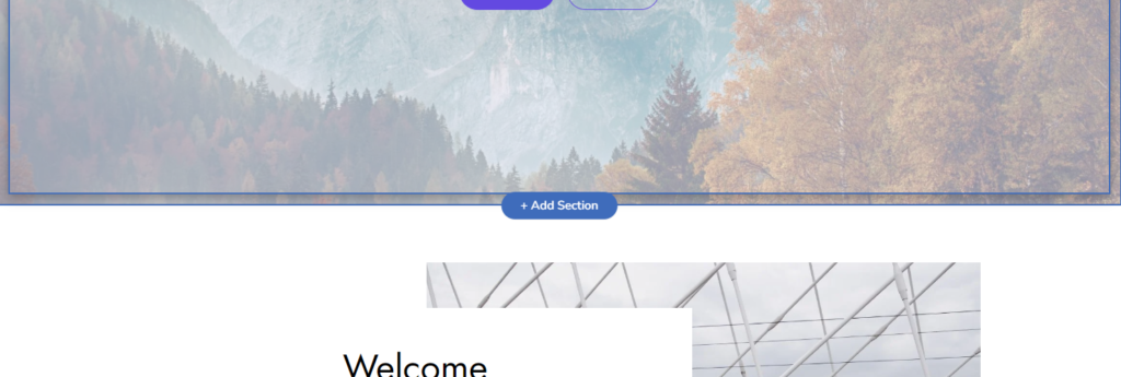
With the Website.com Site Builder, adding white space is a simple and easy process. All it takes is adding a simple spacer section between other content-heavy sections of your website pages to introduce natural breaks and breathing room in your content. To do so, first look for the “Add Section” button that appears between any two already-existing sections on your website.
In the pop-up interface that appears, scroll to the bottom of the “Add a Section” left menu to find “Spacer” at the very bottom of this menu and click on it.
You’ll be given the ability to add a spacer section to your site page by clicking on the “Add Spacer Section” button.
Once the spacer is added to your site page, you’ll be able to customize its parameters like its size and color in the left toolbar when you click on the spacer. Explore the different forms your spacer could take to find a suitable fit for your website’s design and content.
Remember to feature simple neutral colors like white, off-white, or light grey across all of your website content to keep your content looking appealing and accessible. Nobody wants to read content on a bright pink or neon green background. Keeping your color usage simple, with perhaps only one or two non-white colors complementing the rest of your website’s features, is a great way to achieve an appealing presentation of your content that stays away from being overwhelming or unpleasant to navigate through.
Use Colors Consistently
Across your website and its content, a main goal you should always be aiming to achieve and maintain is your consistent usage of colors. Your site visitors will want to browse across your content with as little confusion, inconsistency, and in its presentation as possible. When your website is designed with color usage that changes arbitrarily or irregularly depending on where site visitors go while browsing your website, this contributes to a sense that your content is unorganized, and ultimately confusing to navigate. This feeling, whether your site visitors are directly aware of it or not, will contribute to your site visitors leaving your website to find alternatives that offer them a consistently-designed content browsing experience, which will reflect in lower site visitor numbers than your site would otherwise have.
To design your website with straightforward and consistent presentation, ensure that the same elements which have the same purpose across your entire website, such as buttons or drop-down menus, feature the same color usage schemes. For example, if you have “Contact Us” buttons featured across different pages of your website, keep them all one consistent color no matter where they are on your website, so that your site visitors can have a clear and consistent idea of how they could reach out to you.
Depending on how expansive your website and its content is, and your current experience and affinity for color design, you might be feeling a little unsure of your ability to keep track of consistent color usage across your entire website. You’re certainly not alone, and luckily, there are great and effective solutions to this challenge. Particularly, Website.com offers handpicked color palettes that can be chosen and applied automatically across your entire website to ensure consistent and effective color usage. These wide ranges of color palettes feature colors that have been chosen because of their great matching amongst themselves. This lets you find the perfect fit of colors for your business site, personal portfolio, or any other usage you might find for your site.
Explore Your Own Color Palettes
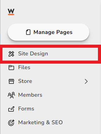
The pre-chosen color palette options might not be exactly what you’re looking for, and that’s entirely alright. You also have the ability to customize your own custom color palette for usage across your site. This lets you explore different options for how you want your content to be presented to your site visitors. It also gives you a chance to use your business colors to keep your branding consistent. To customize a color palette, first click on “Site Design” in the left toolbar of your Site Builder interface.
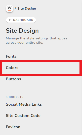
From here, under the section labeled “Site Design”, look for “Colors” and click on it.
You’ll be taken to a section labeled “Colors” that allows you to choose from a wide range of pre-chosen color palettes you can apply to your website.
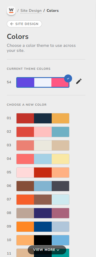
To customize the colors featured in the color palette your site is currently using, click on the pencil icon next to your currently-selected color palette. Hovering this pencil icon should make the word “Customize” appear so that you know you’re looking at the right icon.
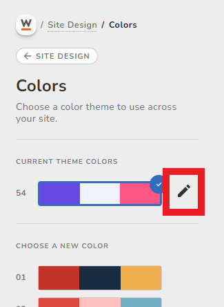
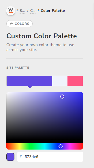
Clicking the pencil icon will bring you to a menu where you can freely customize the colors featured in the color palette your website is currently using.
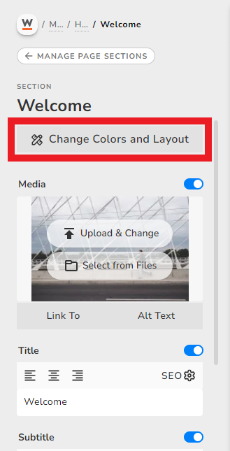
Now this color palette will be applied to your entire website, which is a great way to keep your style consistent. The website builder will adjust the shading and contrast based on your chosen color palette. However, if you want more control over the specific colors used within each section, you can edit your section colors.
To adjust or choose custom colors to specific elements within each section, click on a section. You will see a button labeled “Change Colors and Layout.”
Click the button “Custom Section Colors” and you will see the colors that have been assigned to each element depending on your chosen or custom color palette. For example, you will see the elements labeled “Background,” “Title,” “Button,” etc.
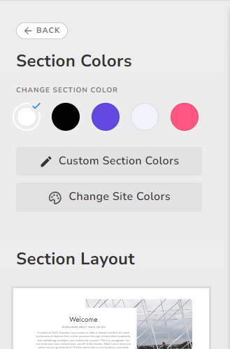
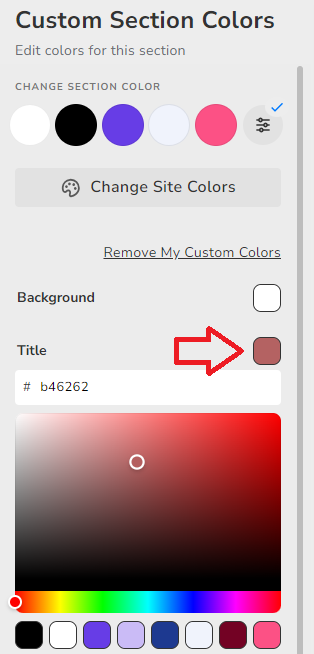
Click on the color box beside each element to choose a specific color that you would like to adjust.
Experiment with different colors that suit your website’s purpose, goals and brand until you find the right colors for your website and content.
Conclusion
After reading this article, you now know more about the importance and usage of color design for websites. The perfect color design for a website might not come about from your very first attempt at finding and using colors, but with every new experience you gain and attempt you make, you move closer to finding a great way to present your website content to your site visitors. Express yourself and your website’s purpose with your color usage guided by our tips and advice, and you’ll see the difference even minor changes in color can make to bringing your website to life.