The design and wording of buttons on your site can make a huge impact on your website. With the right button design and call to action, you can actually see an increase of sales and site engagement.
When you construct a call to action, the key is to get the message across in an exciting way.
Make sure your call to action is specific, simple and clear, so users know exactly what they would get into if they click the button. For example, you would probably get more clicks on a button that says “Reserve My Seat” versus just “Go”.
Adding a sense of urgency can increase button clicks as well. An example of an urgent call to action would be “Claim My Free Trial Now.” Bonus tip: the word “Free” is one of the biggest motivators for users to click a button. If you have a free trial or service that you want people to know about, consider incorporating it into your button text!
It’s also important to think about the text style. Ensure your button font is clear and easy to read. Generally, uppercase letters and sans serif fonts are good choices.
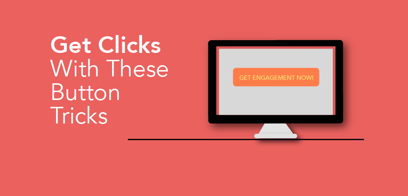
Next, you’ll want to think about the colour of your button. Adding contrast is a simple way to draw attention to your button.
Feel free to consider colour psychology, as different colours can create different moods for your visitors. For example:
- Pink can be playful, feminine, and exciting
- Blue tends to create a sense of trust and loyalty
- Red can signify power and passion, but on the flip side, can also give off an anxious feeling associated with danger
- Gray can give a feeling of reliability, but can also appear gloomy or conservative
When you choose a colour, be sure to think about how it plays into the overall design on your site, and whether it sparks the feeling you are aiming for.
We’ve created a video to show you how to incorporate these tips when you add buttons with the Website.com site builder. Take a look and let us know what you think!